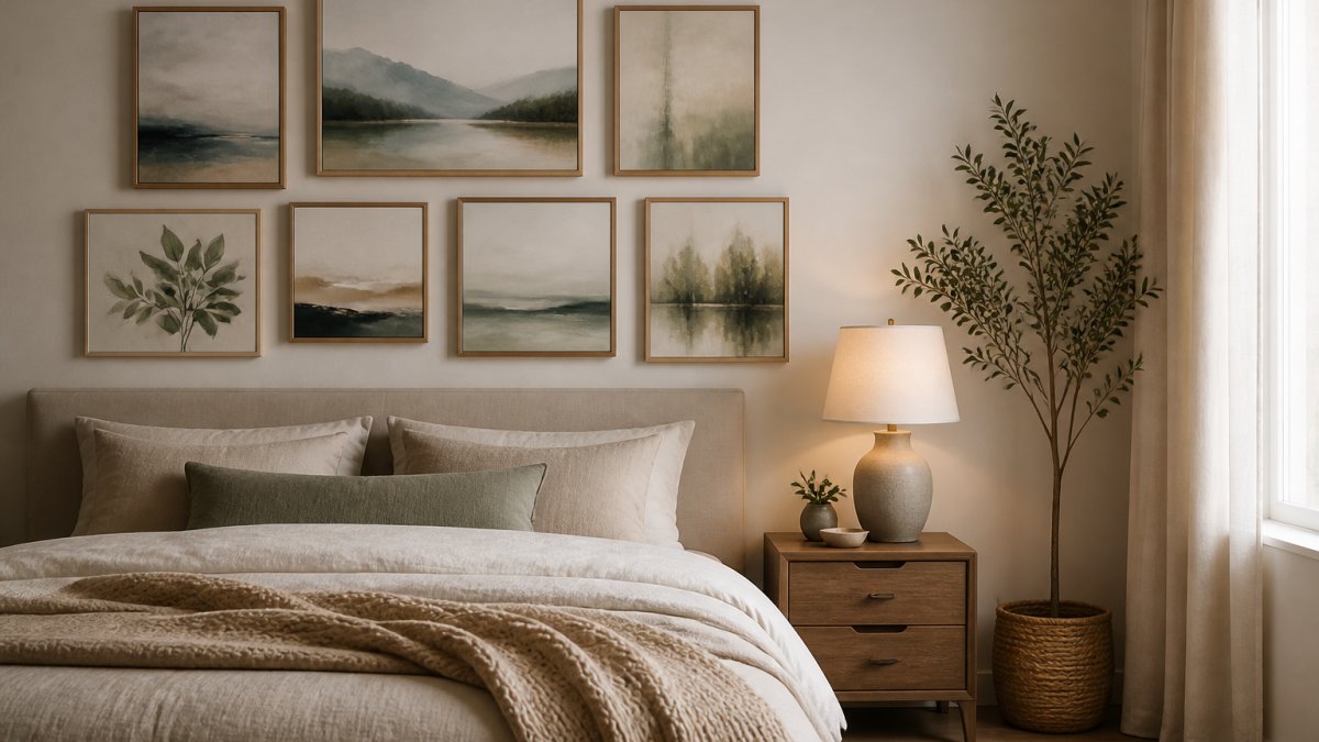
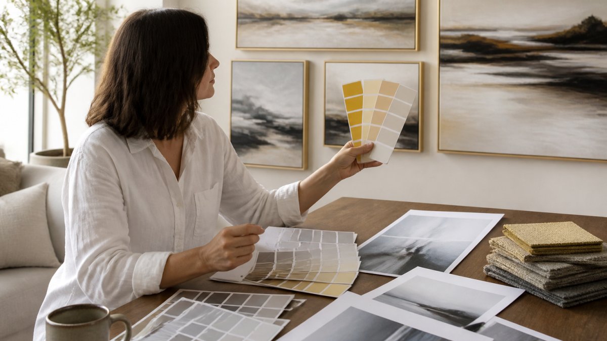
 ultimate-guide
Tips for Choosing Wall Art Colors: A 2026 Guide
Table of Contents
- Understanding Color Theory for Wall Art Selection
- How to Match Wall Art with Room Colors
- Wall Art Color Palette Ideas for Every Room Style
- Wall Art for Neutral Rooms: Building Calm with Color
- The 60-30-10 Rule in Interior Design and Wall Art
- Testing Colors Before You Buy: Lighting and Digital Previews
- Common Mistakes When Choosing Wall Art Colors
- Your Step-by-Step Workflow for Choosing Wall Art Colors
- Frequently Asked Questions
Last Updated: October 5, 2026
Understanding Color Theory for Wall Art Selection
Color theory is the science of how colors interact, influence mood, and create visual harmony. When selecting wall art, these principles transform guessing into intentional design. The foundation rests on three concepts: the color wheel, complementary relationships, and analogous harmony.
The color wheel organizes colors into a circular spectrum showing how they relate. Warm colors (reds, oranges, yellows) energize a space, while cool colors (blues, greens, purples) create calm. Neutral colors (grays, beiges, blacks, whites) anchor a room and let artwork shine. Most successful wall art selections start here, identifying whether your space needs warmth, coolness, or balance.
At Randy Mann Art, we understand that choosing wall art colors isn't about picking what looks pretty in isolation. It's about creating a visual conversation between the art, your walls, furniture, and the feeling you want the room to evoke.
How to Match Wall Art with Room Colors
Matching wall art with room colors requires a systematic approach. Start by identifying what's already in your space, then decide whether your art should blend in or stand out. The two primary strategies: working with your dominant color or creating contrast through complementary selections.
Start with Your Room's Dominant Color
Your room's dominant color sets the visual foundation, typically your wall color, largest furniture piece, or flooring. Starting here prevents choosing beautiful art that clashes with everything around it.
Identify your dominant color by asking: what color do I see most when I enter this room? If your walls are soft gray, that's your anchor. If a deep blue sofa dominates the seating area, that's your reference point. Your wall art should then either echo that color or provide purposeful contrast.
When art echoes your dominant color, it creates visual continuity. A landscape with cool blues and grays feels natural in a room with blue-gray walls and gray furniture. This builds calm and cohesion, ideal for bedrooms, offices, or spaces that should feel settled.
Using Complementary Colors for Visual Impact
Complementary colors sit opposite each other on the color wheel and create visual tension that draws the eye. If your room's dominant color is blue, its complement is orange. A warm orange-toned abstract against blue walls creates immediate interest and prevents the space from feeling flat.
This strategy works best when you want art to be a focal point rather than background harmony. A gallery wall in a neutral room gains energy from complementary choices, and a living room with beige walls can support bold red or teal artwork because those colors provide intentional contrast rather than accidental discord.
The key distinction: complementary colors should feel chosen, not random. A cool complementary accent in a warm space (cream walls, golden lighting, tan furniture) feels deliberate; the same piece in a cool-dominated room reads as a mistake.
Creating Harmony with Analogous Colors
Analogous colors sit next to each other on the color wheel: blues and greens, reds and oranges, yellows and greens. They create natural harmony because they share similar undertones. Wall art in analogous colors to your room's palette feels sophisticated without requiring the visual pop of complementary contrast.
A room with green walls pairs beautifully with artwork featuring blues and teals, while warm beige walls welcome art in cream, soft gold, and warm gray. This creates what designers call a "monochromatic scheme with variation", unity without monotony.
Analogous schemes work particularly well where you want calm focus: bedrooms, meditation rooms, or home offices where visual noise would be counterproductive.
Wall Art Color Palette Ideas for Every Room Style
Different room functions call for different color strategies. Understanding these distinctions helps you choose wall art colors that support the room's purpose, not work against it.
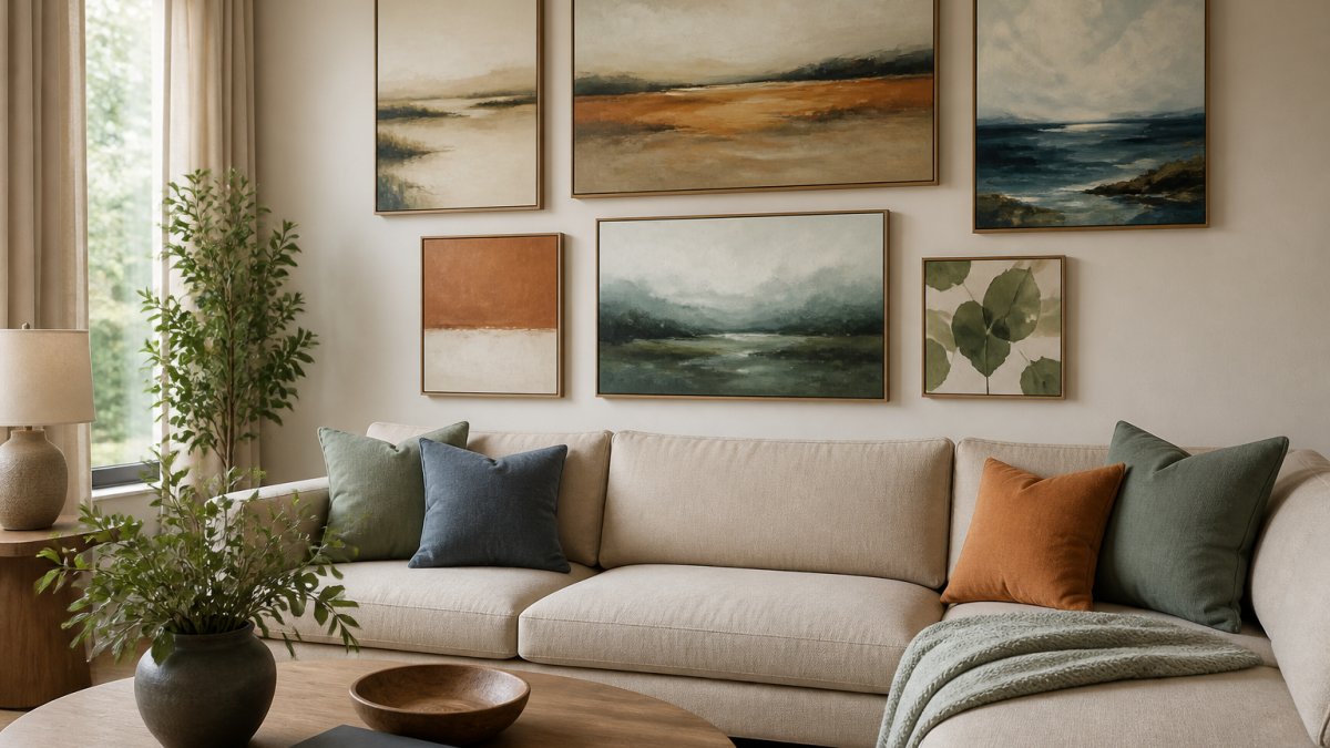
Bedroom palettes benefit from calming, restful colors. Soft blues, muted purples, warm grays, and gentle greens create an environment that supports sleep and relaxation.
Living room palettes accommodate more variety because living rooms serve multiple purposes: entertaining, relaxing, gathering. Warm earth tones (terracottas, ochres, warm grays) pair well with accent colors, and the space's natural visual complexity supports bolder choices.
Home office palettes should support focus and productivity. Cool colors (blues, greens) enhance concentration without the stimulation of warm tones. Abstract pieces or minimalist landscapes provide visual interest without distraction.
Entryways and hallways set the tone for your home. These transitional spaces benefit from artwork that bridges your home's overall color story, creating visual flow between warm and cool rooms.
Wall Art for Neutral Rooms: Building Calm with Color
Neutral rooms present both opportunity and challenge. White, gray, beige, or soft taupe walls create a blank canvas where artwork becomes the primary color statement, and many homeowners hesitate over whether to introduce bold color or stay understated.
The strategy depends on your goal. For a calm, understated room, choose soft, muted tones: pale blues, warm grays, soft greens, or monochromatic pieces. The art becomes a subtle accent, ideal for minimalist interiors or spaces where you change décor seasonally.
To introduce color into a neutral room, artwork becomes your tool. A single bold abstract piece or a gallery wall with coordinated colors transforms the space without paint or furniture replacement, particularly effective when you rent or want to avoid permanent changes.
The common mistake in neutral rooms is playing it too safe. A pale gray painting on white walls disappears. The art needs enough tonal contrast or saturation to be visible and intentional.
The 60-30-10 Rule in Interior Design and Wall Art
The 60-30-10 rule is a foundational interior design principle that applies directly to choosing wall art colors. Sixty percent of your room should be your dominant color, thirty percent a secondary color, and ten percent an accent.
This framework prevents color chaos.
Applying this rule means choosing wall art that completes rather than competes. If your room already has strong color statements, your art should be the final punctuation mark. If the room is predominantly neutral, your art can be bolder.
Many people choose wall art in isolation, forgetting this principle. A large, intensely colored artwork in a room already saturated with color creates visual overwhelm; the same piece in a neutral room becomes the perfect focal point.
Enter your email below and we'll email you a 20% OFF Coupon right now! →
Testing Colors Before You Buy: Lighting and Digital Previews
Choosing wall art colors without considering lighting is a costly mistake. The same painting looks dramatically different under natural daylight, warm incandescent bulbs, and cool LED lighting. Before purchasing, understand how your room's lighting affects the artwork's appearance.
Natural light changes throughout the day. North-facing rooms get cool, consistent light that mutes warm colors and brightens cool ones. South-facing rooms get warm, intense light that intensifies warm tones and can wash out cool colors.
Artificial lighting adds another layer. Warm white bulbs (2700K) make artwork appear warmer and cozier, while cool white bulbs (4000K or higher) make colors more clinical and true-to-life.
This is where Randy Mann Art's augmented reality feature becomes invaluable.
If digital preview tools aren't available, request high-resolution images and view them in the actual room under different lighting, or print small versions and tape them to your wall for a few days. These low-cost tests prevent expensive mistakes.
Common Mistakes When Choosing Wall Art Colors
Understanding what goes wrong helps you avoid the same pitfalls. The most frequent errors fall into predictable patterns.
Choosing in isolation is the most common mistake. Selecting artwork in a store, online, or at a gallery without considering your room creates a mismatch.
Ignoring undertones causes subtle but persistent discord. A cool gray wall (blue undertones) and a warm gray painting (yellow undertones) will visually conflict, just as a navy wall and periwinkle artwork may not harmonize.
Overwhelming with color happens when people introduce multiple new colors at once. In a neutral, calm room, a large, intensely multi-colored piece can feel jarring.
Forgetting about scale and proportion affects color impact. A small bold piece might disappear on a large wall, while a large muted piece might dominate a small room.
Choosing trendy colors over personal preference creates regret when trends shift.
Your Step-by-Step Workflow for Choosing Wall Art Colors
Transform the selection process from overwhelming to manageable with this systematic workflow, replacing emotion with intentional decision-making.
Step 1: Identify your room's purpose and desired mood. Clarify what you want the room to feel like: calm, energized, focused, welcoming?
Step 2: Document your room's dominant color. Photograph your space in different lighting and note your wall color, primary furniture piece, and flooring.
Step 3: Identify your secondary colors. What other colors are already present? Additional furniture, artwork, décor, rugs?
Step 5: Choose your color strategy. Will your art echo your dominant color (harmony), provide complementary contrast, or use analogous colors?
Step 7: Consider size and placement. A small piece needs bold color to make impact; a large piece can be more subtle.
Step 8: Make your selection with confidence. Once you've worked through these steps, trust your process. You've considered your space systematically rather than emotionally.
Choosing wall art colors doesn't require artistic training or design credentials. When you move beyond guessing and follow a systematic approach, the anxiety disappears, and you'll select artwork that genuinely enhances your environment.
Frequently Asked Questions
How do I choose wall art colors that match my room?
Start by identifying your room's dominant color, the wall paint, large furniture piece, or rug that anchors the space. Then decide whether you want your artwork to echo that color for harmony or contrast with it for visual interest. Consider your room's lighting, existing décor, and personal taste. Using an augmented reality preview tool lets you see how colors work in your actual space before purchasing, removing guesswork from the decision.
What is the 60-30-10 rule in interior design?
The 60-30-10 rule is a color balance formula: 60% dominant color (walls, large furniture), 30% secondary color (accent furniture, medium décor), and 10% accent color (accessories, artwork). Wall art typically fills the 10% accent role, making it the perfect place to introduce a bold or contrasting color. This proportional approach creates visual harmony without overwhelming the space, whether you're designing a living room, office, or bedroom.
Should wall art match the colors in a room?
Not necessarily. Matching artwork to your room's dominant color creates a cohesive, calm aesthetic, ideal for bedrooms and relaxation spaces. Alternatively, choosing art with contrasting or complementary colors adds visual interest and energy, making it effective in living rooms and offices. The best choice depends on your desired mood and the emotional effect you want. Test both approaches using digital previews to see what feels right for your space.
How do I choose art for a neutral room?
Neutral rooms offer flexibility. You can introduce color through artwork without overwhelming the space, or keep the palette soft for a minimalist feel. Consider warm neutrals (beiges, taupes) paired with artwork in warm earth tones, or cool neutrals (grays, whites) with cool-toned art. A single bold accent color in your artwork can anchor the room without clashing. Lighting matters significantly in neutral spaces, test how your chosen art looks under different light conditions before committing.
What colors make wall art stand out against a wall?
Complementary colors create the strongest contrast: if your wall is blue, warm oranges and golds pop visually; if your wall is warm, cool blues and purples stand out. High-value contrast (light art on dark walls or dark art on light walls) also creates impact. Consider the mood you want, high contrast draws attention and energizes, while subtle color shifts feel sophisticated and calm. Viewing conditions and lighting affect how much artwork stands out, so preview it in your actual room.
How quickly do original artworks sell out, and should I wait or decide now?
Original artwork can sell quickly, especially popular pieces. If you've found an original that speaks to you, it's worth deciding sooner rather than later. Use an augmented reality preview to confirm it works in your space, and if it fits your budget and style, purchasing reduces the risk of missing out. Many online art retailers, including those with original collections, maintain inventory, but unique pieces do have limited availability.
Can I use augmented reality previews on any smartphone?
Most augmented reality art preview tools work on smartphones with AR capability, typically iPhones with iOS 12 or newer and Android phones with Android 7 or newer. Before purchasing, check the retailer's system requirements and test the AR feature on your device. This ensures you can preview artwork in your space before buying, which is especially helpful when you're uncertain about how a color will feel on your actual walls under your room's natural and artificial lighting.