 blog
blog
Calming Wall Art for Bedroom Decor: 7 Soothing Ideas
Table of Contents
- Why Calming Wall Art for Bedroom Decor Changes How You Rest
- Nature Wall Art for Bedroom: Landscapes, Botanicals, and Coastal Prints
- Abstract Wall Art for Bedroom: Soft Shapes and Neutral Palettes
- Wall Art Above Bed: Sizing and Placement That Works
- Color Choices for a Calmer Bedroom: What the Evidence Says
- Budget, Materials, and Buying Tips for Calming Bedroom Wall Art
- Conclusion
- Frequently Asked Questions
Last Updated: October 4, 2026
Why Calming Wall Art for Bedroom Decor Changes How You Rest
At Randy Mann Art, we've watched how a single well-chosen piece can shift the entire mood of a room. Calming wall art for bedroom decor is any artwork selected specifically to lower visual stimulation and support rest, usually through soft color, gentle subject matter, or simple composition.
The reason is simple: your visual field is the last thing your brain processes before sleep. A busy gallery wall above the bed keeps your eyes working when they should be winding down. A soft, low-contrast piece does the opposite. Below, we'll show you seven ideas that work, plus exact sizing and placement rules so you get it right the first time.
Nature Wall Art for Bedroom: Landscapes, Botanicals, and Coastal Prints
Nature wall art for bedroom walls works because natural scenes are the least demanding images for the human eye to process. Research on restorative environments, including work summarized by the American Psychological Association on nature and well-being, consistently links natural imagery to lower stress and improved mood. You don't need a study to feel it, though. Stand in front of a calm horizon line and your breathing slows on its own.
Three directions cover most bedrooms:
- Landscape photography: Soft horizons, misty fields, quiet lakes. Look for low-contrast images rather than high-saturation sunsets.
- Botanical artwork: Single-stem prints, pressed leaves, and simple plant studies. These read as calm because they have one focal point.
- Coastal art: Pale sand, muted water, overcast skies. Avoid bright turquoise and heavy wave action, which energize rather than settle.
The mistake we see most often is choosing the most dramatic image in a collection. Drama belongs in a living room. For a bedroom, pick the quietest frame on the wall.
Abstract Wall Art for Bedroom: Soft Shapes and Neutral Palettes
Abstract wall art for bedroom spaces succeeds when it avoids hard edges and high contrast. A soft-focus abstract gives the eye texture without demanding interpretation. There's no story to follow, no subject to identify, which is exactly the point.
What to look for:
- Organic shapes over geometric grids, which feel more mechanical
- Blended transitions rather than sharp color blocks
- Muted neutrals: warm grays, oatmeal, sand, and dusty blue
Minimalist line art is the safest entry point if you're unsure. A single continuous line drawing in a thin black frame reads as modern without feeling clinical. For a softer result, choose line art in charcoal or bronze tones instead of pure black.
Wall Art Above Bed: Sizing and Placement That Works
Wall art above bed placement follows one rule more than any other: the art should span roughly two-thirds to three-quarters of your headboard width.
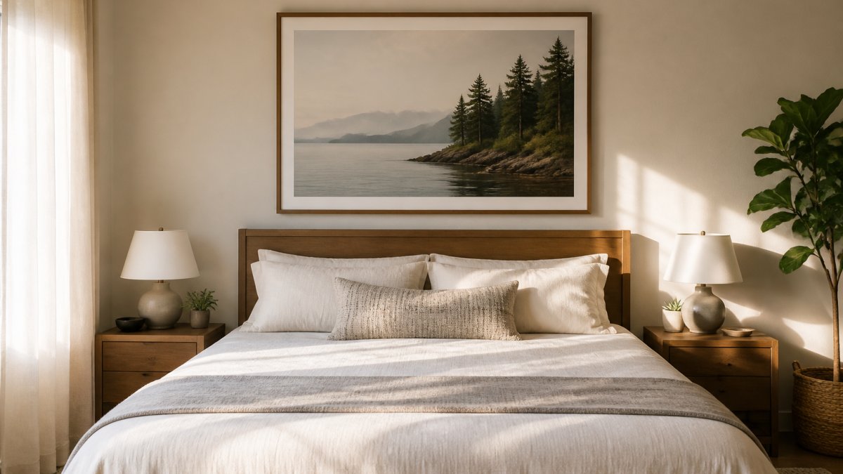
Height matters just as much. Hang the bottom edge 6 to 10 inches above the headboard. Higher than that and the art floats, disconnected from the furniture below it.
| Wall Width | Headboard Width | Suggested Art Width | Layout |
|---|---|---|---|
| 8 ft | 60 in | 40-45 in | One large piece |
| 9 ft | 62 in | 42-46 in | Two matched prints |
| 10 ft | 64 in | 44-48 in | Triptych or three-piece set |
| 12 ft | 66 in | 46-50 in | Wide single or gallery row |
For a gallery wall, keep the arrangement tight. Two to three inches between frames looks intentional. Five inches or more looks like a mistake.
Color Choices for a Calmer Bedroom: What the Evidence Says
Green and sage tones dominate calming bedroom palettes, and it's worth being precise about why. Color psychology research, including reviews discussed by the National Library of Medicine on color and emotion, associates greens and blues with calm and restoration across many studies. But most of that work is correlational, effect sizes vary, and results shift with culture, context, and personal history. Color preference is real and measurable; color-driven changes to stress or sleep are much harder to prove.
Here's the honest version: color won't fix a bad mattress or a racing mind. What a soft palette does is remove friction. Fewer jarring visual cues means an easier wind-down, and that's a real benefit without overstating the science. Treat color as a supporting player, not a treatment.
Enter your email below and we'll email you a 20% OFF Coupon right now! →
A decision framework, not a mood board
Instead of picking a color because a caption called it calming, run your choice through four filters:
- Contrast level. Low tonal contrast between the art and the wall reads calmer than high contrast. A sage print on a cream wall is gentler than the same print on a charcoal wall.
- Saturation. Muted, desaturated versions of any hue settle more than their vivid cousins. Dusty blue beats electric blue; olive beats lime.
- Temperature match. Warm neutrals (sand, taupe, oatmeal) sit easily with wood tones and warm lighting. Cool tones (blue-gray, pale sage) pair with white trim and cooler bulbs.
- Personal association. A color you find restful beats a color a trend list recommends. If deep navy genuinely soothes you, it belongs in your room.
Palette pairings that hold up
- Sage green: pairs well with natural wood, cream bedding, and matte black frames.
- Soft blue-gray: reads cool without feeling cold; works with white linens and light oak.
- Warm neutral: sand, taupe, and oatmeal suit almost any bedroom style and rarely clash.
- Muted terracotta: adds warmth without the energy of a true red; best in small doses.
- Dusty lavender: a quieter alternative to purple, useful when you want softness without green.
Adapting color to the room you actually have
- Small rooms: stay within one or two hues and keep the art light in value. Dark, saturated pieces can visually shrink a tight wall.
- Dark bedrooms: lean into warm neutrals and muted greens. Very dark art on a dark wall disappears; very bright art glares.
- Rental spaces: choose art that works with the existing wall color rather than fighting it. Neutral palettes travel between apartments better than trend colors.
- Modern minimalist rooms: one large piece in a restrained palette, thin frame, generous wall space around it.
- Traditional rooms: botanical prints in warm neutrals, wider mats, and wood or brass frames settle in naturally.
- Bohemian rooms: muted terracotta, clay, and sage with natural fiber frames and layered textiles.
If your bedroom is modern minimalist, lean toward a single large piece in a restrained palette. For a traditional room, botanical prints in warm neutrals settle in naturally.
Budget, Materials, and Buying Tips for Calming Bedroom Wall Art
Art pricing varies widely by format, size, and whether you're buying a print or an original, so it pays to know what you're actually comparing. Most competitors stop at "prints are cheaper than originals." The useful version is a trade-off table plus the questions that decide which format fits your wall, your light, and your budget.
Format trade-offs at a glance
| Format | Typical Durability | Glare Risk | Best For | Considerations |
|---|---|---|---|---|
| Unframed print | Moderate | None until framed | Budget-conscious buyers | Frame and mat add cost and time |
| Framed print | High | Moderate to high with glass | Ready-to-hang rooms | Limited frame and mat choices |
| Canvas print | High | Low (no glass) | Large walls, bedside placement | Can look flat up close; edges need finishing |
| Metal or acrylic print | High | High (reflective surface) | Modern, high-contrast rooms | Reflections can be distracting at night |
| Original painting | Highest | Low to moderate | Collectors, statement walls | One of a kind; higher cost and care needs |
What drives the price
Four factors move the number more than anything else:
- Size. Cost scales faster than size does. A piece twice as wide is often more than twice the price because materials and shipping both climb.
- Edition. Open-edition prints are the least expensive. Limited editions and signed prints sit in the middle. Originals are the top of the range.
- Materials. Archival pigment inks on heavy cotton rag paper cost more than poster stock but resist fading and rippling far better.
- Framing. Custom framing frequently costs as much as the art itself. Standard sizes (like 18x24 or 24x36 inches) let you use off-the-shelf frames and save real money.
Buying notes worth knowing before you commit
- Check the paper weight. Heavier stock resists rippling over time, especially in humid rooms.
- Ask about UV protection. Fading is the most common complaint on sun-exposed walls. UV-filtering glazing or a UV-coated canvas slows it down.
- Think about glare before you buy glass. A glossy frame opposite a window will reflect light back at you. Matte glazing or canvas avoids the problem.
- Match the hanging hardware to the weight. Small prints can use a single hook; large framed pieces and canvases need two points or a French cleat for stability.
- Measure twice. Returns are harder on art than on most home goods, and custom-framed pieces are often final sale.
A simple budget framework
Decide your total spend first, then split it roughly in half: one portion for the art, one for framing and hanging. If the split doesn't work, drop to a smaller standard size rather than a cheaper frame, a well-framed small piece usually looks better than a large piece in a flimsy frame.
At Randy Mann Art, our augmented reality preview lets you see a piece on your own wall before you buy, which removes most of the guesswork. Free shipping applies on domestic orders over $99, and our checkout runs on SSL encryption through a verified secure site.
Conclusion
The hardest part of choosing calming wall art for bedroom decor isn't finding something attractive. It's resisting the urge to buy the boldest piece in the collection. Quiet art asks more of you up front and gives more back every night.
If you'd rather see the piece on your wall before you decide, that's exactly what we built our preview tool for. Randy Mann Art offers original abstract and landscape paintings alongside high-quality prints, an augmented reality preview that shows each piece in your actual space, and free domestic shipping on orders over $99. Enter your email below and we'll send you a 20% off coupon right now.
Frequently Asked Questions
What kind of wall art is best for a bedroom?
Nature-inspired prints, soft abstracts, and minimalist line art in neutral or muted tones work best for a bedroom. These styles create a tranquil atmosphere without competing for attention. Look for calming wall art with gentle curves, soft color palettes, and subjects like landscapes, botanicals, or coastal scenes. Avoid high-contrast or busy compositions that can feel stimulating rather than restful.
What colors make bedroom wall art feel calming?
Soft greens, sage, muted blues, warm neutrals, and gentle earth tones are most associated with relaxation. A calm color palette reduces visual tension and helps the room feel like a bedroom sanctuary. If your decor is modern minimalist, stick to two or three colors across your art and bedding. Color psychology research supports general trends but individual responses vary, so choose tones that feel peaceful to you.
Where should I hang wall art in a bedroom?
The most common placement is centered above the bed, with the bottom edge 6 to 10 inches above the headboard. For a queen bed, a single piece 30 to 40 inches wide or a gallery wall spanning about two-thirds of the bed width works well. You can also hang art on the wall opposite the bed or beside a reading nook. Keep sightlines from the pillow in mind and avoid direct glare from windows or lamps.
How do I choose calming wall art that suits my bedroom decor?
Start with your existing color palette and decor style. For modern minimalist or neutral decor, choose abstract art or line art in soft colors. For a more traditional or organic feel, nature-inspired prints and botanical artwork fit naturally. Consider the size of your wall and bed before buying. Many online galleries now offer preview tools that let you see the art on your own wall, which takes the guesswork out of matching scale and color.